 |
| The Who created one of the most iconic billboard advertisements towering above the Sunset Strip |
Hand painted billboards used to dominate the sunset strip in Hollywood throughout the 70's and then a moment in history changed everything. MTV was born and ushered in a new era on the way we consume music and pop culture.
After checking out these great hand painted billboards it only serves as a reminder as to how much an iconic album meant back in the day. Artwork was crucial to relaying a message rather then just a few key photos or illustrated lines to post to Instagram to make followers stay attentive.
We are huge fans of albums as a package and as a way to help an album be accepted by the mass populace, but these billboards are an art form all to themselves.
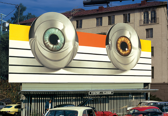
"The enormous, unblinking chrome eyeballs stared down from their perch above L.A.’s famous Sunset Strip as record producers, nightclub owners, and movie stars sped by in their convertibles. The sign included no words, but in 1972, everyone was familiar with “Tommy,” the rock opera about a “deaf, dumb, and blind kid” who plays a mean game of pinball. It didn’t really matter if passing motorists didn’t know these meticulously painted pinball eyes signified the release of the London Symphony Orchestra’s version of the original “Tommy” double album by the Who. The point was to create buzz, and it worked.
“There were the Beatles, 16 feet tall, walking across Abbey Road in my backyard.”Borne out of the social and artistic upheaval of the late 1960s, rock-’n’-roll billboards flourished for a little over a decade, disappearing in the early 1980s as musicians put their money into music videos and televised ads. Executed by skilled painters who mostly remained anonymous, these billboards pushed the boundaries of roadside advertising, with cryptic imagery and unpredictable designs that literally burst from their rectangular borders.
Though the billboards were destroyed after their contracts ended, a budding young photographer named Robert Landau documented the heyday of these unique signs as he roamed Sunset near his home. As a teenager, Landau was in the thick of L.A.’s edgy music culture and wanted to capture these billboards before they were gone forever.
A few years ago, Landau published a complete catalog of his photos, called “Rock ’n’ Roll Billboards of the Sunset Strip.” On March 24, 2015, an exhibition of Landau’s gorgeous color photographs will open at the Skirball Cultural Center in Los Angeles. We spoke with Landau about his obsession with this unparalleled, and extinct, advertising genre.
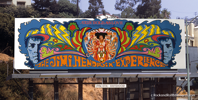 |
| Top: The Tommy billboard from 1972 featuring gigantic chrome pinball eyes. Above: An early billboard mural for the Jimi Hendrix Experience in 1968. Photos by Robert Landau. |
Collectors Weekly: Do you remember the first photo you took of these billboards?
Landau: The first one I took is actually the cover of my book, and it was pretty much by chance. I was 16 years old, and my folks had just divorced. I went to live with my dad in his apartment about a block from Tower Records, which is a block above the heart of the Sunset Strip. I was just getting into photography, so I had wandered down the street with my camera. And there were the Beatles, 16 feet tall, walking across Abbey Road in my backyard, basically. That ended up being one of the most historic of all the rock-’n’-roll billboards just by chance.I didn’t have a larger sense of history at the time, but I would see them painting over these billboards after about a month, and I knew if I didn’t get a picture when they were up, they’d be gone. So I was aware from an early age that it was an ephemeral art form. But mainly, I was interested in having slideshows for my friends who didn’t live in the area, to show them what they couldn’t see in person—this incredible art that was being put up on the Sunset Strip and then painted over.
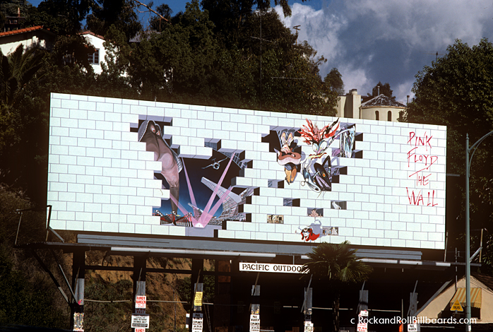 |
| In 1980, the white bricks of this Pink Floyd billboard were slowly removed over a period of weeks to reveal the imagery underneath. Photo by Robert Landau. |
Collectors Weekly: What was the significance of the Sunset Strip?
Landau: By the late ’60s, the Sunset Strip had become the heart of the music industry, even internationally, because all the New York companies had moved out here to catch what was going on with the rock-’n’-roll scene. Besides record companies, the Strip also had amazing record stores like Tower, these all-night places where people could buy the latest music. Then you had all these legendary clubs like Whiskey a Go Go. You even had hotels, like the Continental Hyatt House where Led Zeppelin, among other bands, carried on and made their home away from home.There was a whole scene going on along the Strip, but it was really focused on rock ’n’ roll. The billboards captured all that energy, and also some of the excess of money and drugs.
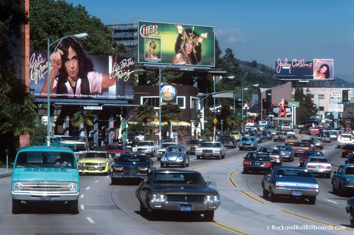 |
| A view of Sunset in 1979, with hand-painted billboards for Eddie Money, Cher, and Judy Collins. Photo by Robert Landau. |
Collectors Weekly: Who started the music industry’s billboard trend?
Landau: As far as I can tell, it was the Doors in 1967 for their debut album. I talked with Jac Holzman—the head of Elektra Records who signed the Doors—while writing my book. In 1967, he had just come out here from the East Coast and opened an office on La Cienega Boulevard, not far from Sunset Boulevard, and it occurred to him that billboards were being used for everything except promoting records and music. A lot of radio stations where popular disc jockeys worked were farther east on Sunset, and he knew they drove on the Strip, and that the entertainment industry in general was based there.The Doors were really into it; the whole band even climbed up on top for a photo shoot. Jim Morrison was quoted as saying he thought it was cool he’d be hanging over the Strip like a specter. I think at that time, it cost about a thousand dollars a month, which was quite a bit of an investment then. Elektra signed on for a year, and they had several different billboards. Little by little, the other record companies caught on.
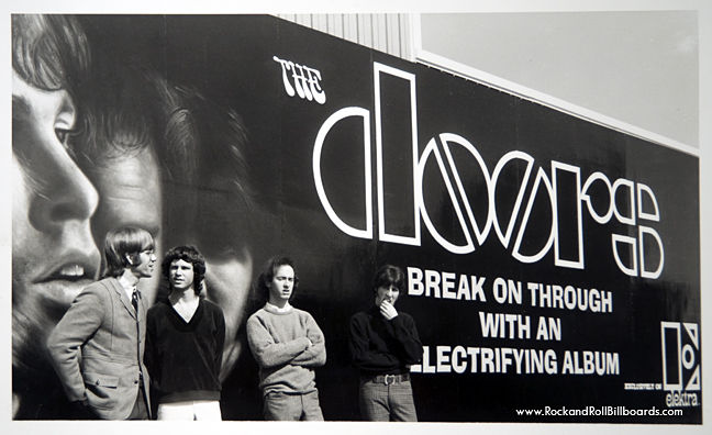 |
| The Doors posing against their 1967 billboard, which supposedly started the trend. Photo courtesy of Clear Channel Outdoor Archives. |
Collectors Weekly: Why were these billboards hand-painted?
Landau: Well, they were too big to enlarge as photographs, and although there were printed poster billboards at the time, they just didn’t have the same quality. The painted ones had a sheen and depth to them, and the personal touch that you only got from an artist hand-painting them. Somewhere around the late ’80s or early ’90s, I think, the digital prints started being used. But when that was first happening, they would put them next to a top-quality hand-painted sign, and the painted version was still much better. Now, of course, everything is digital, but in my mind, there’s still a place for hand-painted imagery—I think it has a quality that’s quite different from these predictable digital images.“It was about creating an image, and about a trust between the artist and the record companies.”But in the 1960s and ’70s, hand-painted billboards were the state of the art, so they’d use them in places like the Sunset Strip and maybe a few other spots like Wilshire Boulevard or Westwood Village. They were costlier, too, but with the hand-painted ones, you could add plywood extensions: If you’re painting Rod Steward’s head, his hair could stick over the top, or painting the Beatles for their “Abbey Road” album, their heads could extend above the frame of the billboard. It was just another way to catch people’s attention, something you couldn’t do with a poster billboard.
There’s a great story about that Beatles billboard. When “Abbey Road” came out in 1969, there were all these rumors going around that Paul McCartney was dead. People were playing their records backward, looking for clues, and even claimed that the image on the cover of “Abbey Road” was like a funeral procession. Realizing this helped sell records, the Beatles didn’t do anything to squelch the rumors. They just let it fly. At some point, while that billboard was up on Sunset, a couple of kids got up there with a saw and cut Paul’s head off the billboard.
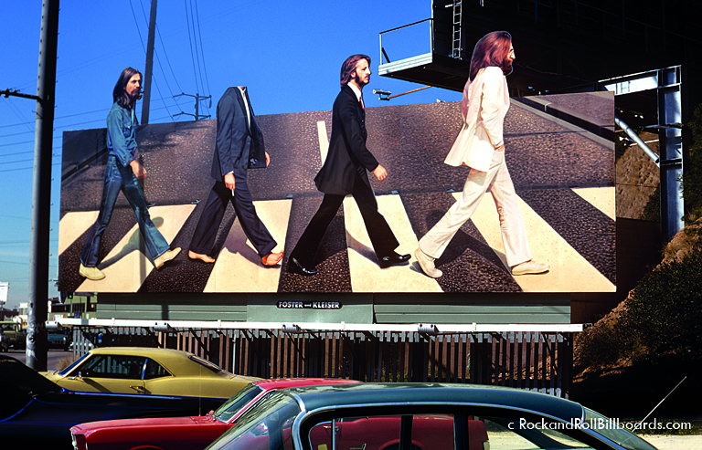 |
| In 1969, a teenager stole Paul McCartney’s head from this “Abbey Road” billboard, fueling rumors of the singer’s death. Photo by Robert Landau. |
When my book came out, I posted on my Facebook page, “I’ll give a free copy of the book to anyone who could tell me what happened to Paul’s head.” The next day, I get a call from a guy named Robert Quinn, who is in his 60's now, and on his 16th birthday, he had climbed up there and cut the head off. He still has it hanging in his living room somewhere in the San Fernando Valley. I went out and took a picture of him holding Paul’s head. Thanks to him, a little piece of rock ’n’ roll history got preserved because the rest of the billboard is long gone.
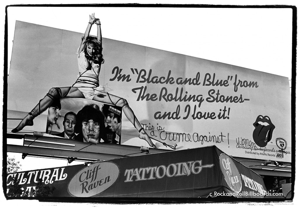 |
| Some billboards created controversy, like this 1976 ad for “Black and Blue,” which Landau captured complete with outraged graffiti about violence against women. Photo by Robert Landau. |
Collectors Weekly: Were there specific artists known for painting billboards?
Landau: There’s a guy who’s considered the godfather of billboard painters. His name was Mario Rueda, and he just passed away in his late 90s. I got friendly with the guys at Foster and Kleiser, one of the biggest billboard companies, so I knew a lot of the painters because I was hanging out around the studio where they painted.Not only was Mario considered the best painter, but he also schooled a lot of the younger guys; they apprenticed under him. He was responsible for painting that “Abbey Road” billboard. Mario explained that if you painted these signs too tightly and perfectly, they wouldn’t read at a distance. You don’t really get the full experience of these artworks until you get up close and see the scale, because normally you’d see them in your car from a distance. But when you get right up close to them, they dissolved a bit and looked pretty strange.
First, they would create a giant stencil and “pounce” charcoal onto it so they had a charcoal outline to work from. When they were painting up on scaffolding, the artists couldn’t get very far back, so they would use what’s called a reducing glass, which is the opposite of a magnifying glass. They had to paint with looser brush strokes and use a little more contrast, and a little more red than usual so that the signs would look good a few hundred yards away as opposed to right up close.
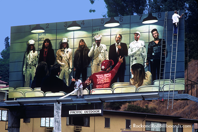 |
| Painters put the finishing touches on a Cheap Trick billboard in 1979. Photo by Robert Landau. |
Collectors Weekly: Who actually designed these billboards?
Landau: It was a joint process, but in most cases, the musicians had already commissioned amazing artwork for their albums. For example, the Rolling Stones paid Andy Warhol to design an album cover. The concept typically came from the person who art-directed the album cover. I talked to a bunch of those guys, people like John Van Hamersveld and Norman Seeff, who created a lot of that art and deserve credit for the imagery that was up on those billboards.But the question was, how do you render that design for billboard dimensions, translating this square album cover to a large horizontal shape? At a certain point, album covers themselves went from being single-sleeves to the gate-fold design, which folded in half. Those required longer designs where the main imagery fell on the right side, so when it was folded over, that became the front of the square cover. A lot of this cover art lent itself quite easily to a billboard.
Like the “Abbey Road” billboard, that’s a fairly simple image. But someone had to decide to cut their heads out and how to crop the square cover photo into a horizontal shape. That was either done by the art director, who designed the album cover, or somebody else at the record company, or even the billboard company. They never really credited the person who made that adaptation from one form to another.
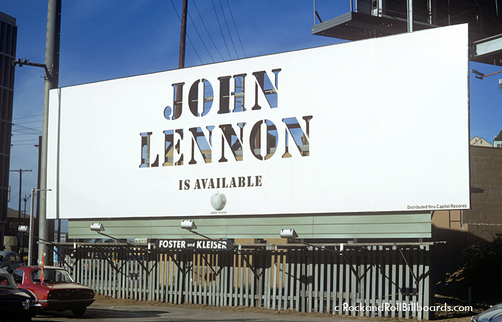 |
| An understated billboard created for John Lennon in 1971 utilized cut-out lettering. Photo by Robert Landau. |
Collectors Weekly: What were some of the most unique billboards you photographed?
Landau: Because all the record companies were in L.A. and most of the artists were living there, they were all trying to outdo each other. A lot of creativity was poured into them. Sometimes, they were simpler things, like the one for John Lennon that just said, “John Lennon is available.” It was a white billboard and the letters of “John Lennon” were cut out, so you actually saw through the sign. It was a minimalistic approach. There was another one for a Frank Zappa movie called “200 Motels” in which they had everybody who was in the movie painted onto the billboard, so that went to the other extreme.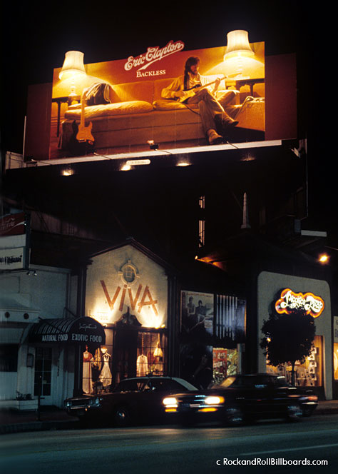 |
| This 1978 Eric Clapton billboard included two 3-D lamps that actually lit up at night. Photo by Robert Landau. |
Others had sequential campaigns where they might reserve a billboard for two months, and while it was up, they’d alter the image over time. There was a Pink Floyd billboard for “The Wall” where when it first went up it was just the outlines of a bricked-in wall. Little by little, they took some of the bricks off, so if you passed it a couple of times during the month, you’d see this image being revealed underneath the bricks. It was a great way to build anticipation for a record.
Collectors Weekly: What trends did you notice while documenting these signs?
Landau: I think the thing that set the rock-’n’-roll billboards apart from other billboards at the time, and probably ever since, is that it really wasn’t about making a sale. It wasn’t about getting somebody to a cash register to buy something. It was about creating an image, and about a trust between the artist and the record companies.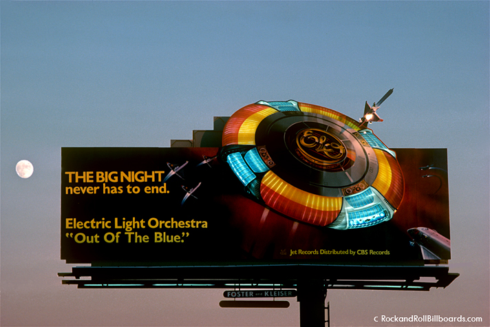 |
| Electric Light Orchestra commissioned this billboard with a giant illuminated spaceship, later used for their stage shows, in 1979. Photo by Robert Landau. |
One great billboard for a recording of the “Tommy” album—not by the Who but by the London Symphony—had these two giant chrome pinball eyes photo-realistically painted on it. If you were driving down the street, you’d practically hit the brakes when you saw it. You might have no idea what this was about, it didn’t say “Tommy” or anything on it. They had this leeway to treat these billboards as art pieces, bridging that gap between fine art, commercial art, and the urban landscape.
I think the death knell for these hand-painted rock-’n’-roll billboards was when MTV came along in ’81. In the ’70s, ELO spent $50,000 on a billboard, which was a lot of money. They attached this Plexiglas spaceship to their billboard that had rotating light circuitry, and it eventually got used in their live acts. But when MTV started, all the money people spent on signs was siphoned off into producing music videos, effectively ending the creative output that went towards billboards. It was a very unique period that lasted only about 12 or 13 years.
(See more amazing images in Landau’s book, “Rock ’n’ Roll Billboards of the Sunset Strip” or visit the exhibition at the Skirball Cultural Center in L.A. before August 16, 2015. To order limited edition prints of these photographs, contact Robert Laundau directly.)


